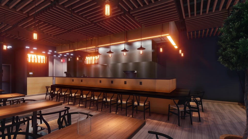
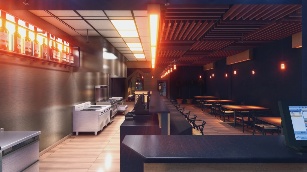
TUTTI FRUTTI FROZEN YOGURT CAFE

Everybody love an ice cream, but way more attractive the frozen yogurt delicious, for those who gauge, control the fat and calories.

Tutti Frutti Frozen Yogurt is the largest self-serve frozen yogurt retailer, worldwide. With 680+ locations in over 30 countries

Tutti Frutti franchises all use own brand of cutting-edge machinery

In the designated store on 6191 Currents drive we have designed four machines

Tutti Frutti Frozen Yogurt Canada has expanded to 35+ locations across the nation.

The store works based on self-serving. Into the cups has to be topped up a frozen yogurt from the machine and add the endless flavors topping choices.

This store of Tutti-frutti can be classified as frozen yogurt café because it is designed on sixteen seats for visitors, who keen to enjoy the product into the fun atmosphere.

Most of the colors & patterns were applied according of Franchise brand codes that mimics the fruits and ingredients constituency of product.

In order to avoid “well” effect in the store unit, we have had to segregate the walls visually into two levels in ratio 2/3 by 1/3 first part into cartoon color and upper part in a darkest shade of grey.

Ultimately, the project purpose is to dispel the nitty-gritty days and boost each visitor’s mood.

FINEST WINE TRADERS OFFICE DESIGN

Many of us knows about the wine and wine stores, but vast majority have never ever visited the wine supplier’s offices.

How do they organize their daily environment in order to work efficiently spreading the greatest products to the connoisseurs and among ordinary consumers.

The first request of the client was to be able to arrange three workers offices, one executive manger office and conference board room with a ten seats.

The main challenge faced us to design so many rooms with existing four windows only.

Because of importance to have the day light penetration for comfortable work, we have had to use the glass panel partition walls.

In order to minimize the lunch break time spending out of the office it was suggested to have the dining space and a kitchen nearby.

Each office room has an eight feet tall the wood door.

The interior has so many cold materials such as glass, metal, false stainless steel beams and posts, so we have been forced to mix them with warm type of finish materials.

Wine is associated with cellars we realized there isn’t other options beside to apply the brick veneer on the walls, in some sections of the ceiling in the entry and product showcase zones.

“SAKURA” JAPANESE RESTAURANT

“Sakura” is the first established Japanese cuisine restaurant with ultra modern interior where you can immerse into the authentic “Land of the rising sun” atmosphere once the sun dusk. Here you can enjoy the food and hang out getting a sense of the Japan biggest cities night life. The idea of this nook is touching the culture of an active youth generation and comprehend what do they eat, what the sounds or music they listen and what colors, lights impact on them once the sun dusk.

The pivotal concept of restaurant is to involve the visitors into the food preparation, therefore we have had to move the kitchen and service area into the dining area.

The dining area has the three type of seats, chairs with tables section, the bar zone standard table height counter and the feature the tatami zone , where visitors would be able to get the experience having a meal seating in traditional Japanese posture. The formal way of sitting for both genders is kneeling (seiza). But vast majority of people it deemed uncomfortable. So, we designed the raised floor that allows having couple variations of sitting posture. Men Sit cross-legged, while women with both legs to one side. Anytime they can have a backup position letting to stretching both legs under the table floor void. Tatami room can be easily separated from the dining area by fabric ensuring space private. Raised floor is metal framed and covered by double layer of frost effect an orange colored plexiglass and animated below by led light creating the midnight illumination. On another hand this room opens the spectacular view on the night urban area.

The suspended ceiling has a modular slate wood panel that make a sense of of japanese eco interior, but in contemporary stylization. This extraordinary ceiling conceals the HVAC system grid furthermore it lets nicely to built in the vent diffusers and sprinklers heads.

The “Sakura” restaurant is an excellent spot for hang out and entering into the nowadays theme of Japan culture.

PETRO CANADA CONVENIENCE STORE

PETRO-CANADA convenience store is most spread out stop store across the Canada where you can buy fast coffee, cold drinks, other hot drinks, energy drinks, sports drinks, healthy snacks, chips, chocolate bars and other food.
At this proposed location our goal was to emphasis the brand style revealing some feature elements. As the main colors for interior was selected the best advertising commercial trio as PETRO-CANADA use in their petrol stations:  Red-white grey.  

On one hand this combination of colors make the greatest eye catching match, but we have been forced to add a little bit of eco-style and implemented the touch of nature using the oak wood veneer in cabinets and slot walls.

That approach ensures us to step up further in conceiving the public space as part of nowadays environment.

On another hand we understand this store is associated with innovative Petro Canada business in oil field and this has to be reflected in interior. The open ceiling concept lets us to diversify the regular rectangular plan, playing with round shapes. 

Ultimately, we found the solution to integrate the cylindrical mold above the counter and curved drop ceiling above the sitting zone faced with a stainless steel sheets in order to make the sense of pipeline industry.

Instead to illuminate those two areas using regular commercial light fixtures, we decided to deploy the luminescent type of stretch ceiling spreading the light constantly.

Overall store products are suggested to be spotlighted by flood light and design pendant lights that repeat the concept of round shapes.

The metal headers make the illusion of industrial vent grills, therefore is some sort of extension of designated style.

In conclusion, from our team perspective this small move in convenience store design will make a big gain down the road in this field of business.

BAUHAUS RESIDENCE

This property has been created in BAUHAUS style, inspired by German and founded by Walter Gropius in Weimar 1919 art school that combined art and fine crafts for urban zone.

The house was purpose for owners, who value the freedom from unnecessary things and use functionality of family schedule.

This is pretty affordable dwelling with deeply thoughtful plans for every day routine usage.

It has as only as 2000 sq. ft total area including the upper floor terrace.

It’s hard to list all the indoor and outdoor features of this stunning home, but it has five bathrooms three bedrooms and two saunas ( finish sauna and Hammam).

The gym has an exit the vertical gardens patio.

From the living room disclose a spectacular view to the landscaped backyard with outdoor swimming pool and make an access throughout the retractable doors let you to merge indoor with outdoor space.

Despite of the not so scaled glazed windows tons of natural light penetrate into the rooms, implemented by the corner type windows.

The main floor living room is merged with upper floor space creating up to above the sense of a huge house.

It was developed the feature as a final element of the living room such as 8′ x 10′ convex sky light roof window. The building body shape was built by implementing the cinder blocks measure 16 inches long by 8 inches wide by 8 inches high. Cinder blocks are lightweight, durable and fireproof, making them a useful home building material.

At the very end of the property is situated the modern gazebo with fire pit and the chimney, that can be shelter at the scorching sunny days, either a great retreat at the dark time, when the flame light efficiently reflects from the white walls and illuminates perfectly this nook.

The minimalistically landscape backyard is surrounded by high density conifers and deciduous trees that makes the privacy from the neighbours glances.

The main walls are insulated inside and smooth stucco is faced as main finish, partially covered by matte aluminium siding on front side of building.

Downtown apartment

One bedroom apartment in downtown that suits for time to time accommodation while the business trip. Customer desired to have neutral interior, that have only one accent.


There wasn’t any option beside merging living room with kitchen area, therefore we ultimately we have studio type space with one adjacent bedroom. No doubts, the kitchen has to be cool in contrast of neutral warm main area.

It was selected blue faced cabinets doors with white quartz countertop and eating table.Above dining zone  we decided to implement stretched semi-transparent ceiling with LED module evenly spreading illumination.

Kitchen walls and floor are faced with fade grey porcelain tiles. As kitchen accent it was selected modern ELICA hood fan. 

Living was separated with white oak hardwood floor made in Finland. 

Adjacent partition wall has a false transom, fabricated using the stretched ceiling fabric. Drop ceiling was broken down into three step types slabs.

The bottom one is aligned with kitchen zone ceiling, making the main room highest ceiling elevation as dominant space.

The monochrome washroom is highlighted in green in base free shower. 

Bedroom is pretty small for any frills, so finally the main idea was to make this rest nook as background of the sweet dreams, letting enjoy the spectacular view from the full size  window.

435 Glamorgan Pl. Calgary AB

Home renovation is a challenge? With inspired wizard this process could fascinate any customer, especially if the project is developed taking into account not just a visual priority and functionality but the hint of historical aspects.

We have recently completed the full renovation of the old bungalow in Glamorgan Pl. community with spectacular view to the mountain.

Take a look at these room makeovers that bring updated style and function to areas throughout the house.

Probably, you’ll find tons of ideas for transforming your home’s drab, dated spaces into inviting areas for family and guests alike.

White paint on the walls, ceiling, and floors brightens this once-dark interior and provides a chic backdrop for a mix of modern Italian furnishings.

Lamps brighten the mostly enclosed space, and a stunning chandelier supplies a decor-defining focal point. 

In process, your team’s discussion about the colors solution we conclude to pick the main color on two shades lighter and eliminate on dark features wall.

The facade has been upgraded using cedar shake and natural slate stack stone framed into trim in dutch style.The facade has been upgraded using cedar shake and natural slate stack stone shaped in dutch style trimming.

Ultimately, we coped to complete the exterior before the extrimal frost has came.

BEFORE RENOVATION

The exterior before was pretty neat but bleached.

Unfortunately, we launched the project at the end of the fall and have had to do the exterior even in snowy weather.

The interior had stink old materials, too yellowish.

A-PLUS NAILS

How should be designed a nail salon, where you would be able refresh yourself?

Each of us are longing to have the touch of sun or summer day.

The pedicure spa is separated from the manicure, implementing slightly curved partition walls with colorful glass panels
Whole area is divided into three zones: entry, service area and secluded rooms.
At the end of secluded zone corridor is installed the shining panel, that consists from the stretch PVC fabric behind the non- ordinary
wooden slatted panel. The source of illumination is high power led strip light strapped rows on the wall.
At the very end of the service zone was suggested to arrange the staff nook with cabinets, UV Tool Sterilizer Dryer Heat Sterilization
Equipment for towels. The CNC cut off golden powder coated panel ensures the privacy and decorative features.

The pivotal approach of success in this business is the superior service therefore must to have always natural global type of illumination.
We found the solution to implement three type of sources of light, beside the table light such as:
-(2700K) ceiling directional spot light combining with
-(3500K) high power track light lamps. As decorative light it have been integrated ceiling ambient RGB led light.
Walls are decorated with plexiglass panels”opal effect” in the bottom and warm white eggshell paint above four feet from the floor.
The drop ceiling has the same color as wall in order to create the sense of holistic room.

On the floor is set 24 in. x 48 in porcelain the “Calacatta” type tiles.
In the service area is located three manicure tables for two clients for each and six pedicure chairs. Among those zones is situated the pathway
heading forward to the secluded area.n the middle of this zone. For integrity, was suggested to embrace first two zones the perimeter drop ceiling
and bizarre shaped ceiling above the corridor. As background is determined the light blue stretched ceiling with gloss sheen.
The waxing room has an ordinary minimalist solution. Walls and ceiling are painted in warm white
in order to ensure sufficient light reflection for comfortable work.

HOT POT RESTAURANT ON 10903 23 AVENUE EDMONTON ALBERTA

Have you ever thought about come to restaurant and cook the food by yourself?

No longer you have worry about ingredients, allergens, alike to do not eat some food that you do not like.

Hot pot is a restaurant where you are engaged in the cooking process, also known as steamboat, is a Chinese cooking method, prepared with a simmering pot of soup stock at the dining table, containing a variety of East Asian foodstuffs and ingredients.

While the hot pot is kept simmering, ingredients are placed into the pot and are cooked at the table, in a manner similar to fondue.

Typical hot pot dishes include thinly sliced meat, leaf vegetables, mushrooms, wontons, egg dumplings, tofu, and seafood. The cooked food is usually eaten with a dipping sauce.

Specifically, this restaurant has an open ceiling concept with drop ceiling that create a sense you seat under the canopy. The area is divided into 5 zones: entry-tambour, dining zone, pro prep kitchen area, service area and washrooms.

Behind the service area in dining is situated the bar table for 5 persons and separated with frameless glass vitrine, where while having a meal the visitor can observe the food preparation process of kitchen staff The dining area is rated to serve 35 visitors at once.

Each table is equipped with built in metal bowl and induction stove below. In front of the visitor on the edge of the table is located the controller, where you can set up the appropriate temperature for any food accordingly. Walls are decorated with emulate of “zebrano” wood type laminate panels on the top and the bottom.

The middle part of the wall is filled by theme posters illuminated using led strip light.

Our goal was to create the semi-contemporary semi traditional warm and cozy nook, where visitors could feel as comfortable as in their own home kitchen.

SKINNY HOUSE IN UNIVERSITY AREA OF EDMONTON

Have you ever faced with lack of space on your city property lot?

At Meanwhile our customer had a challenge. He possess the land 27 feet wide and 130 feet long only, that forced him to think about to build something narrow. Tiny, house? Nooo! Modular house? Noo! Camper? Oh my goch! Skinny house? Indeed, let’s consider this idea.

LDLINE team has developed the typical size of skinny house that equal: 17’x50′ 2,5 storey house with 4 bedrooms and 4 bathroom.

Total area is: 1900 sq.ft. + 630 sq. ft. undeveloped basement. Design is contemporary style with front and side cantilevers.

The feature of exterior is combining the urban brick veneer with light metal grill.

Pitched roof is upgraded with solar photovoltaic panels that generate around 290 Kw/h per day, that meet 50% of your average energy needs.

The house has two upper terraces, one in front another one is aimed towards to the backyard.

The skinny house is a solution for those who has a limited property lot and is necessary to arrange maximum private space using every single inch of area.