“PRINCESS THE PEA”PREMIUM KID’S CLOTHING & TOYS STORE IN SOUTH WEST OF EDMONTON

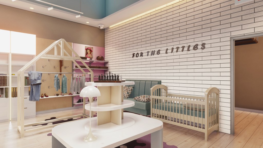
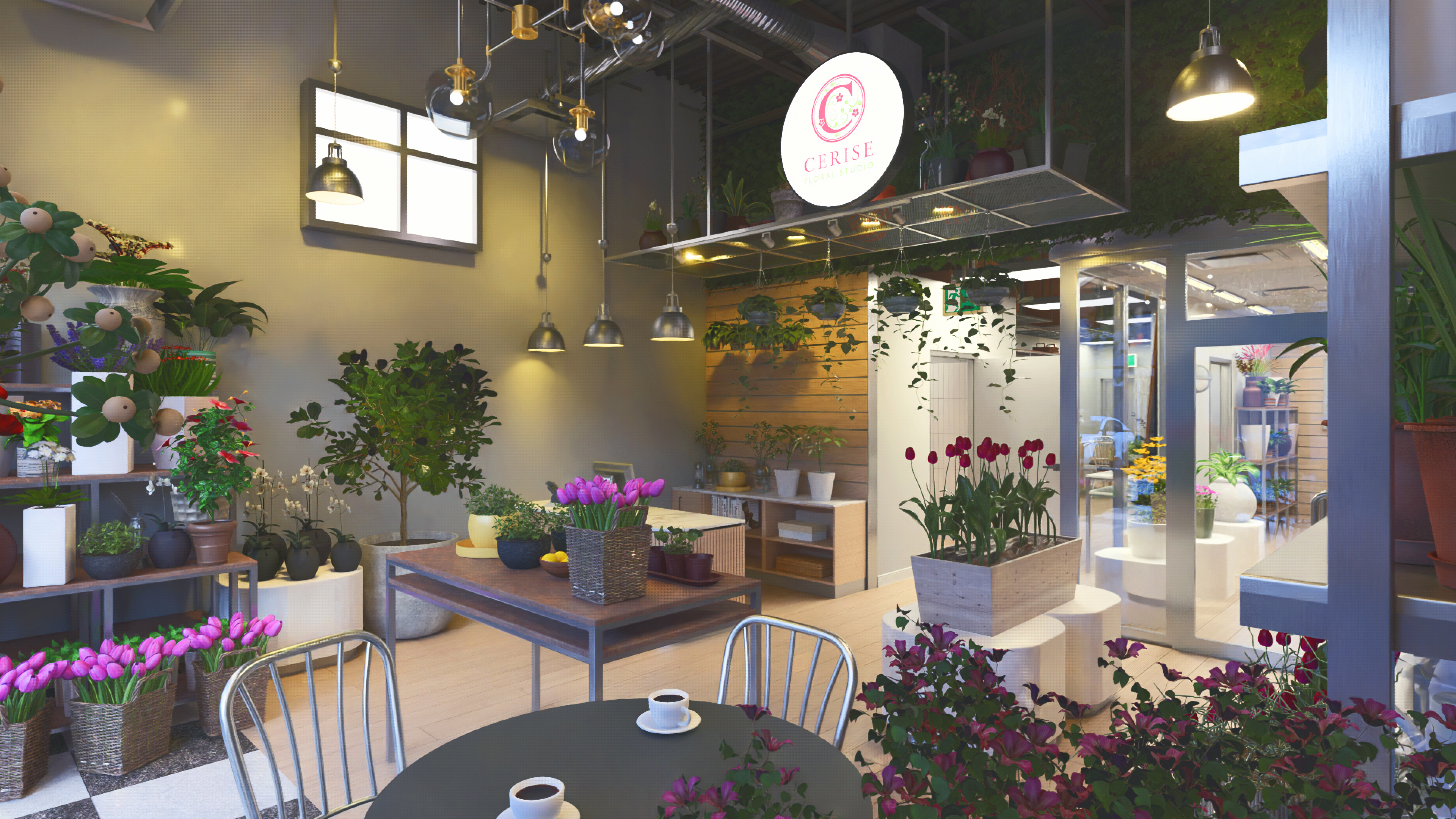
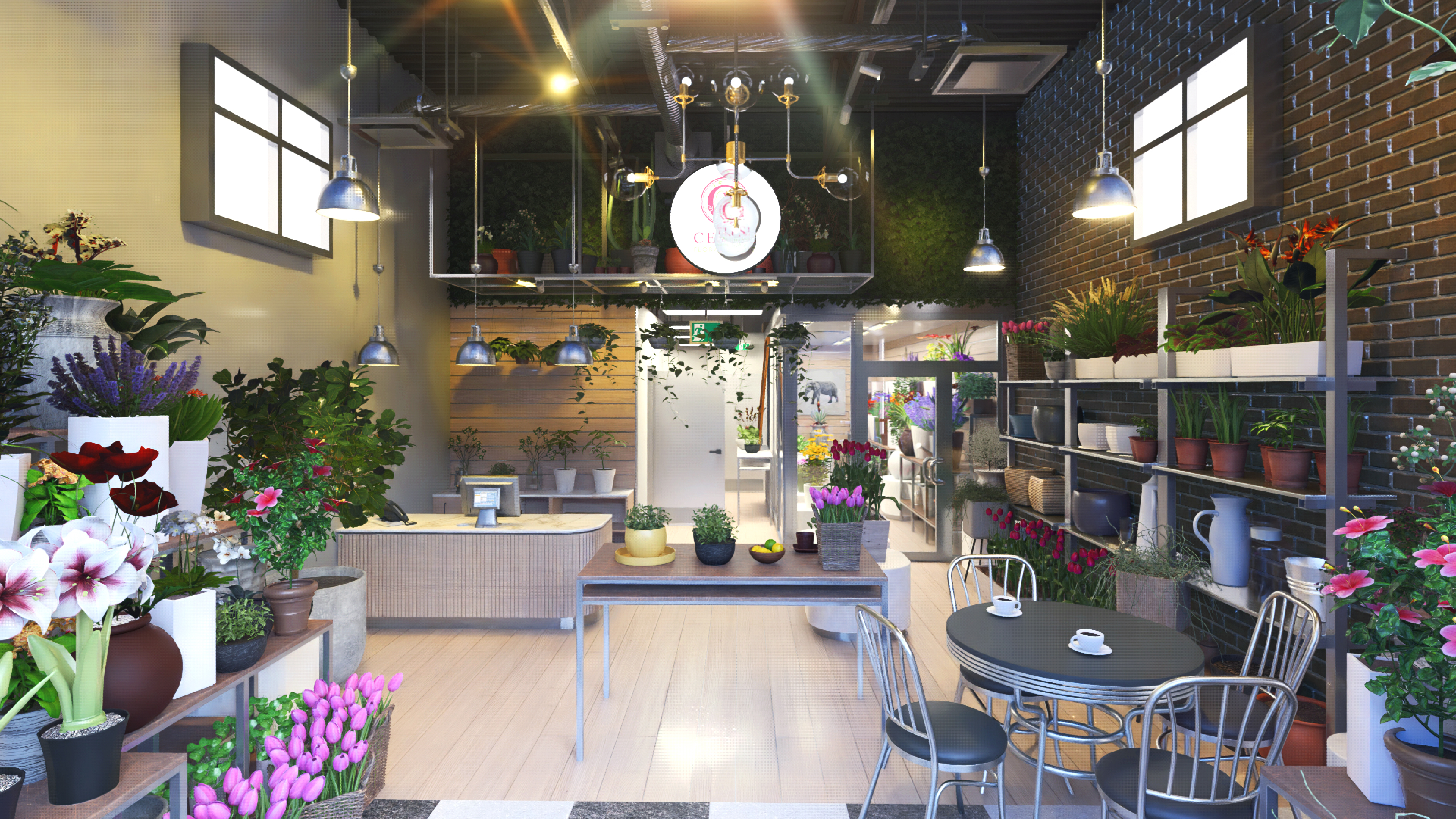
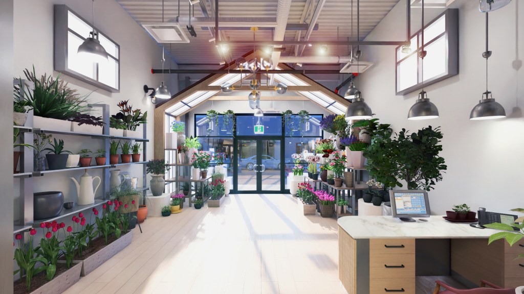
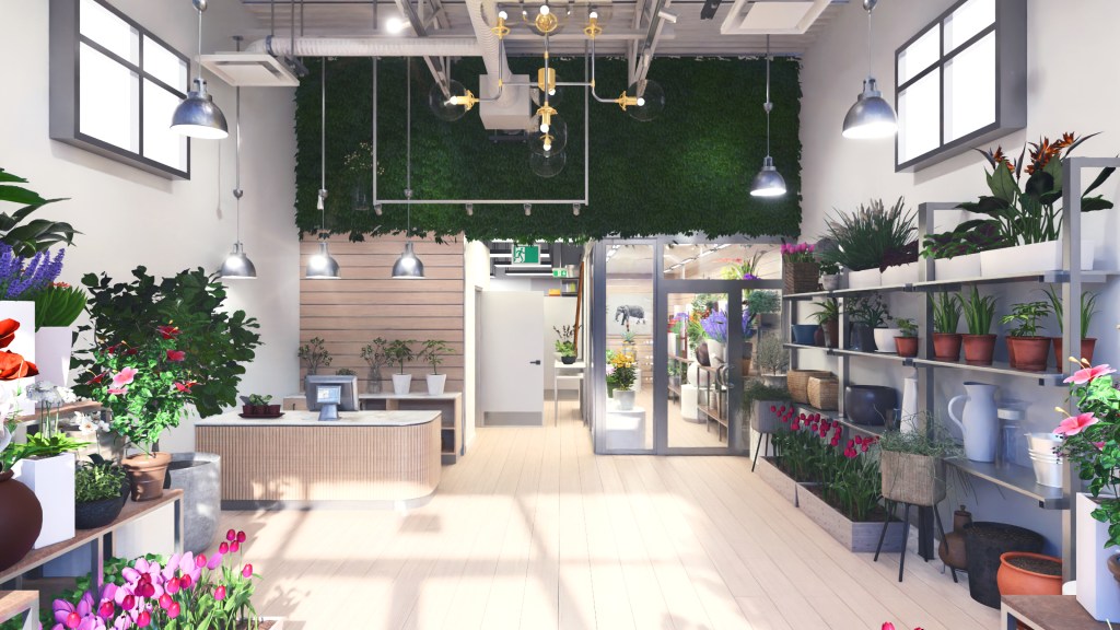
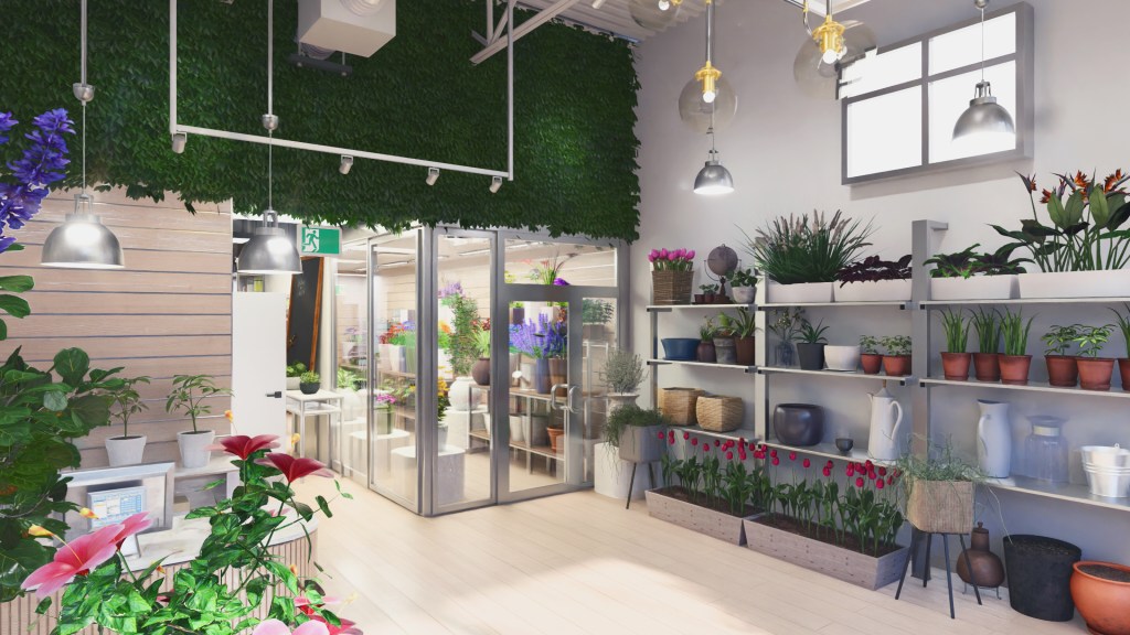
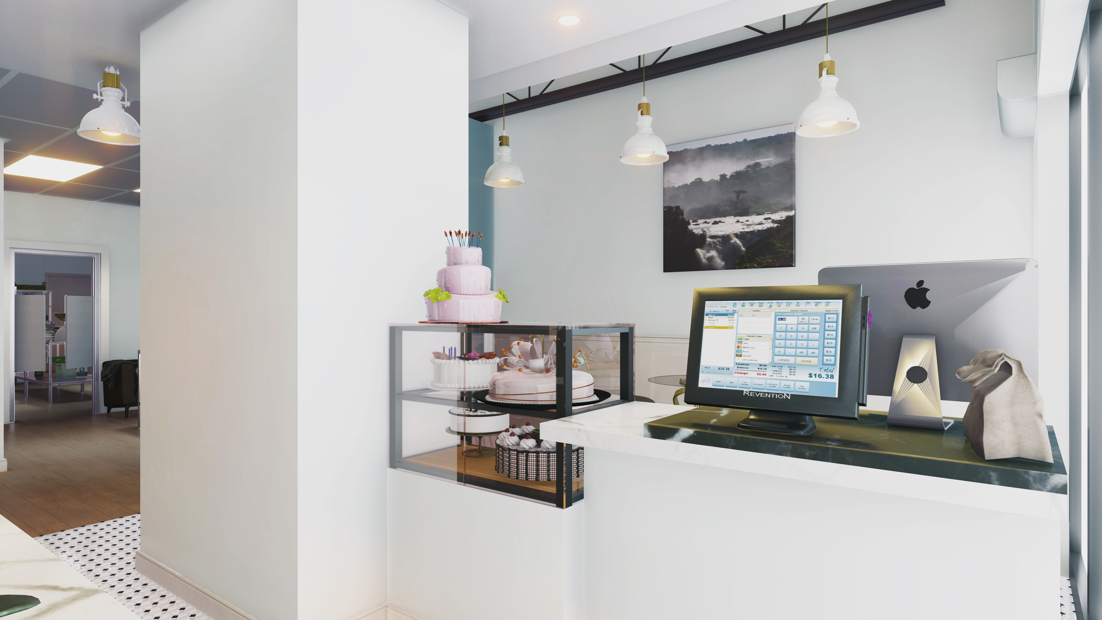
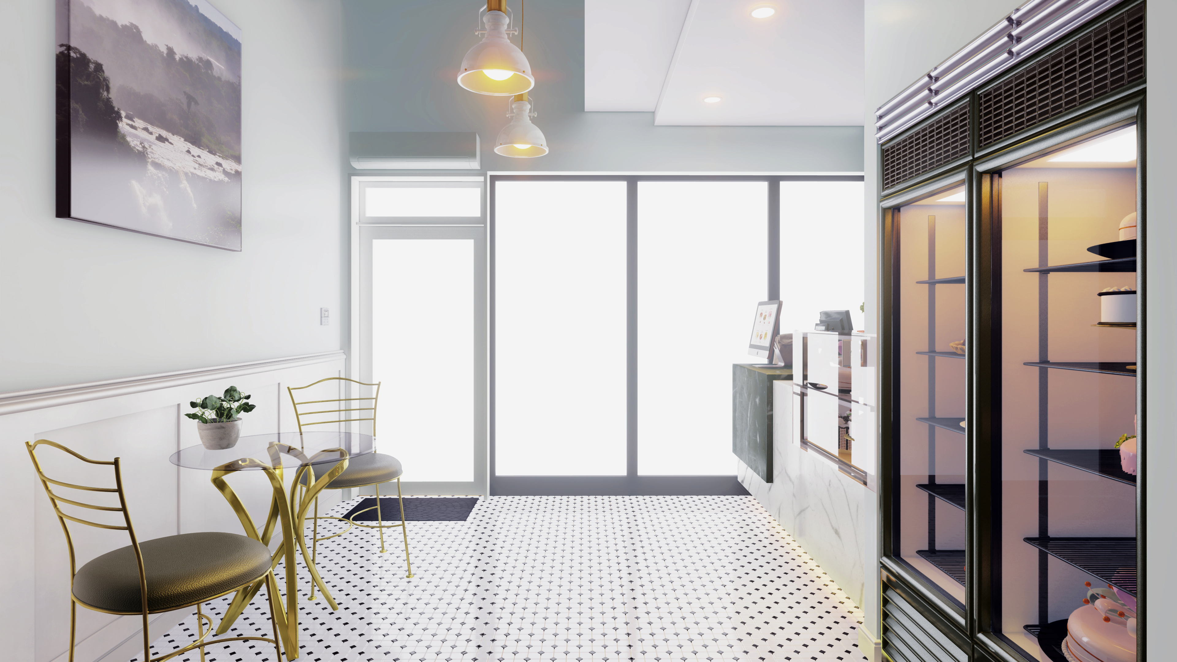
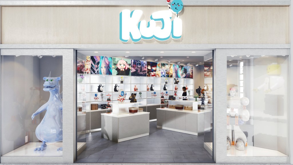
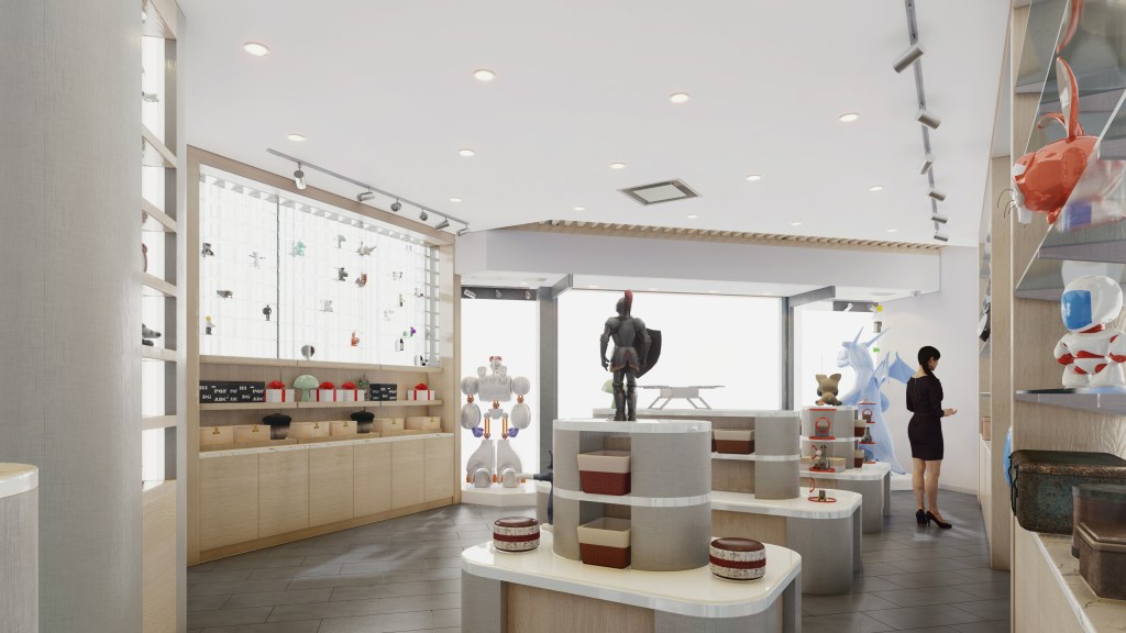
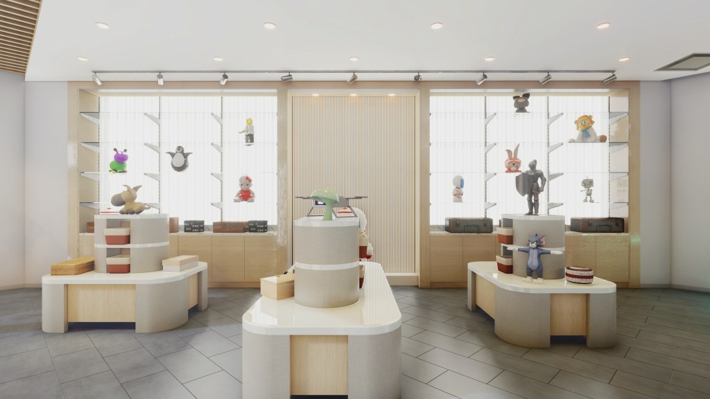
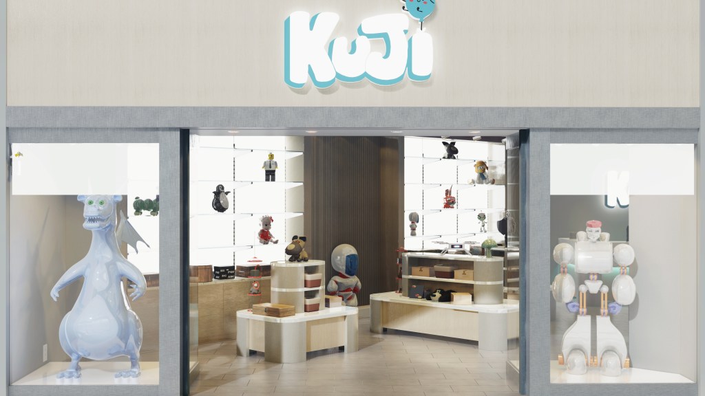
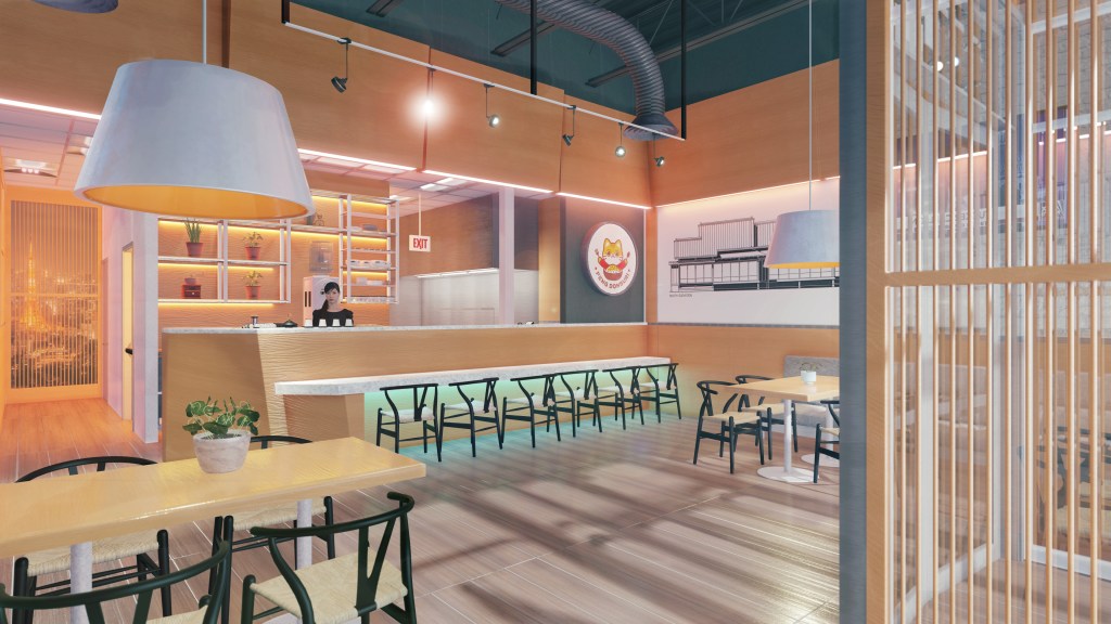
The store was conceived as a ”cozy boutique interior” formed by natural patterns, safe undulating shape structure and tactile sense materials.

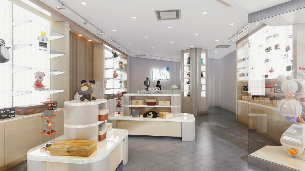
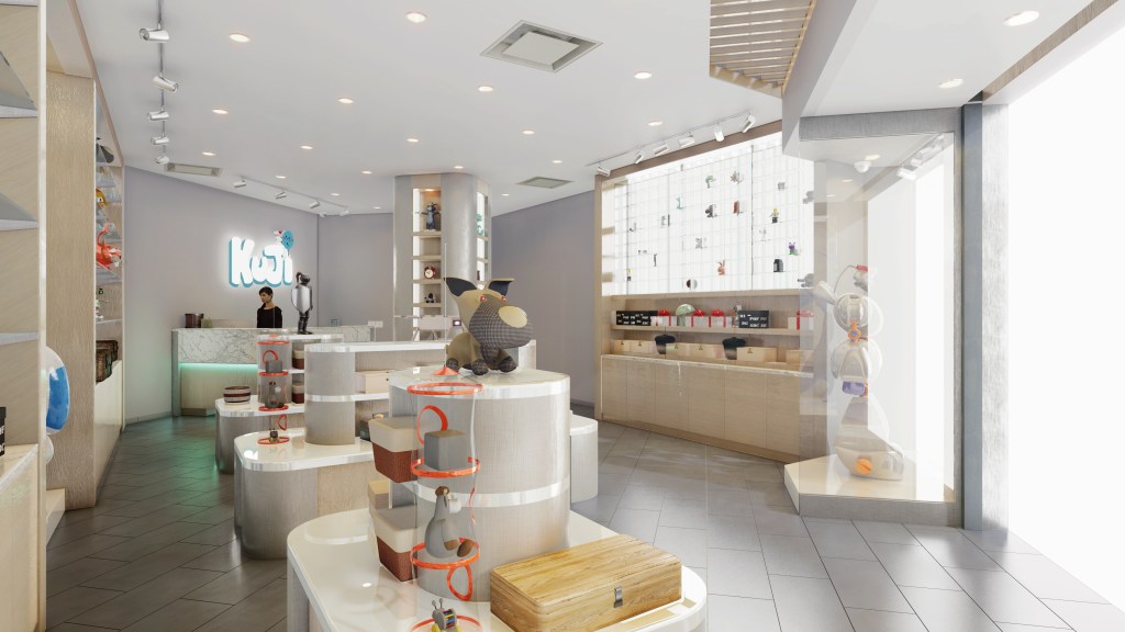
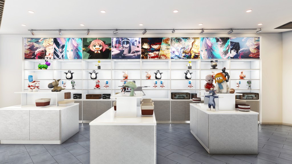
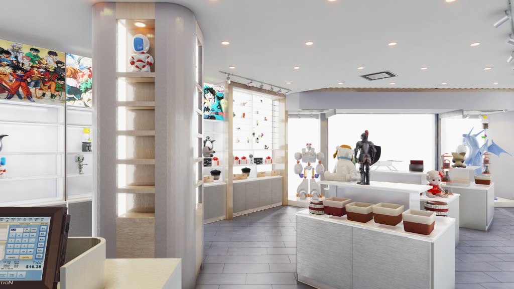
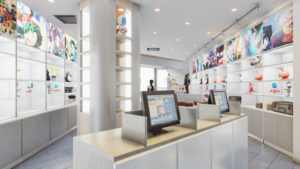
Circulation is organized along the whole entry and retail areas to keep minor visitors obstacle free for observing and having easy access to the goods.

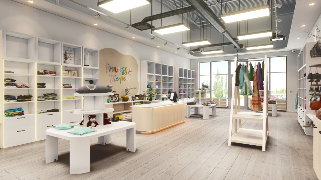
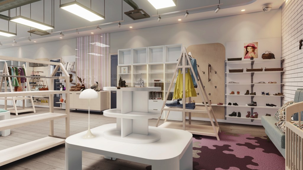
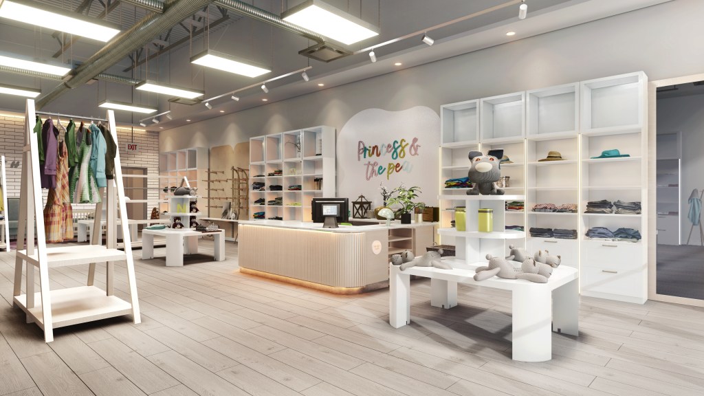
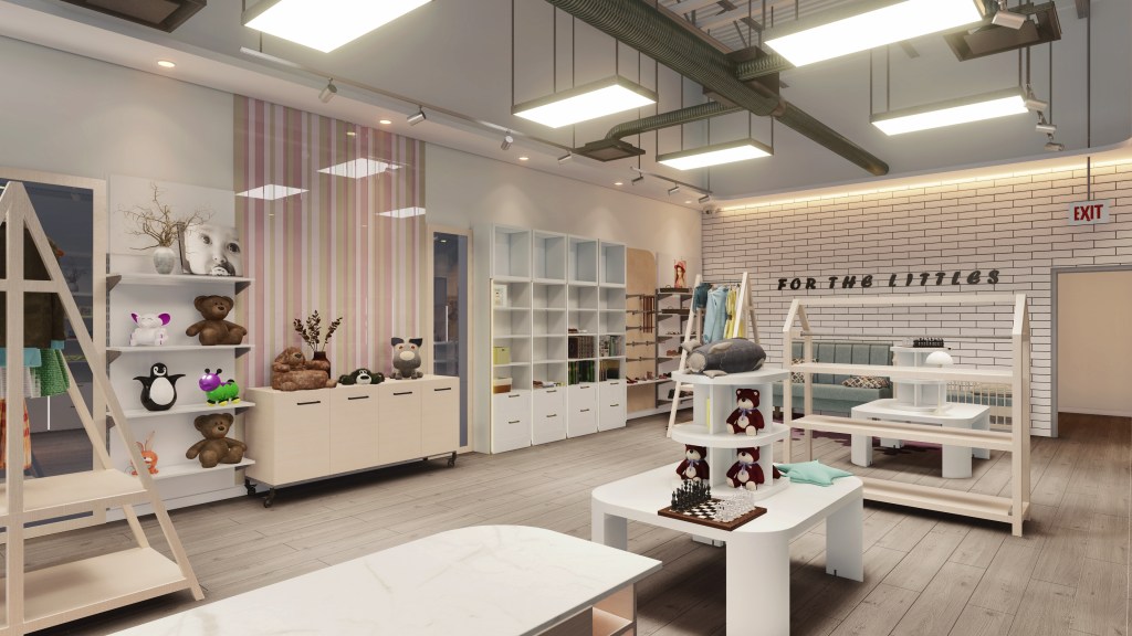
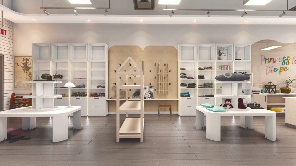
For the  major interior have been selected the light and warm shades of colors in order kids would be able to immerse and to be introduced into fairytale space with a hearty side of the world.

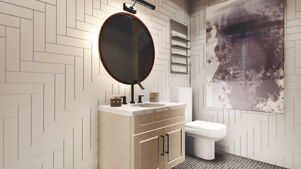
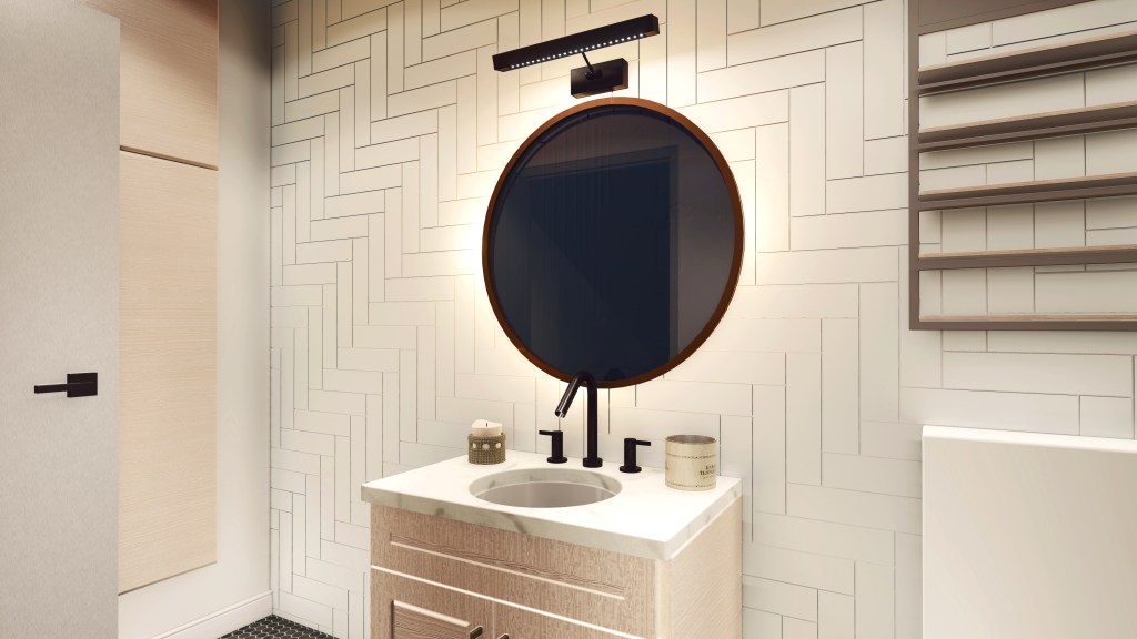
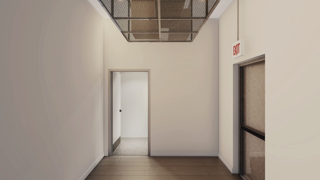
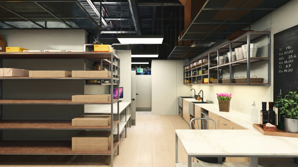
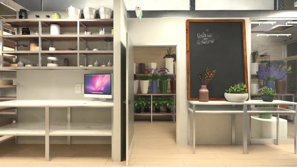
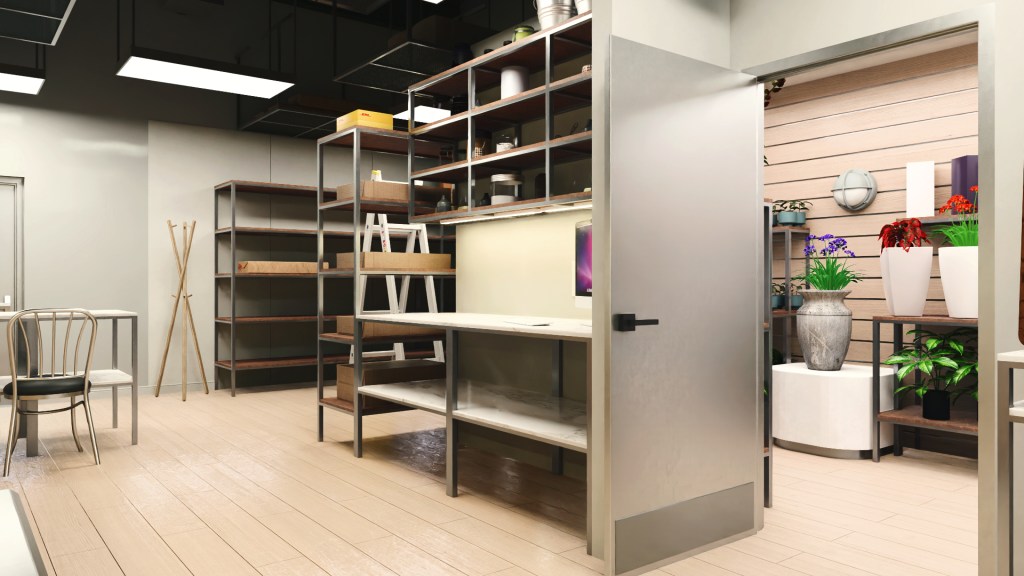
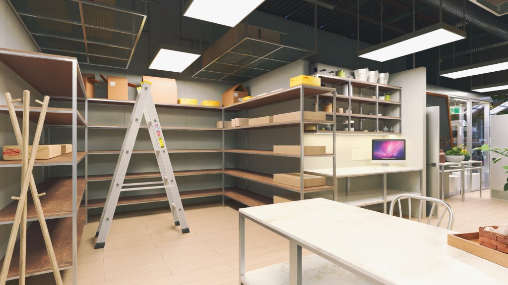
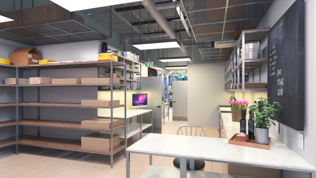
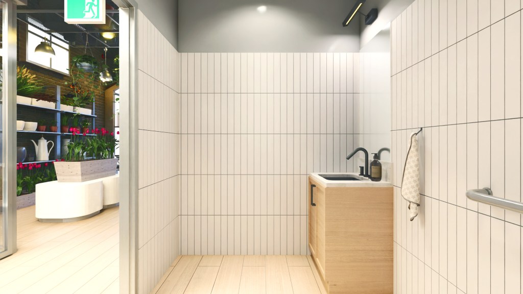
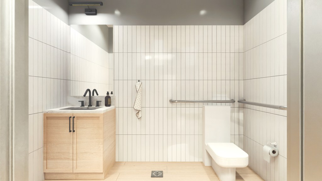
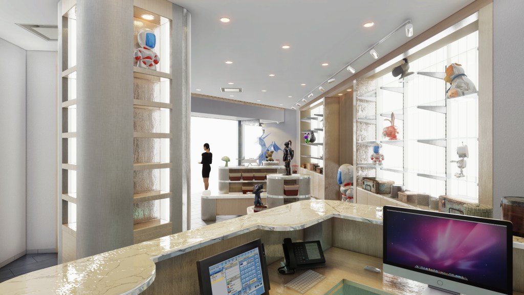
The long tunnel of the unit space has been segregated into a ratio of ¼ of overall area occupied by barrier free washroom storage versus ¾ of overall area for the retail space.

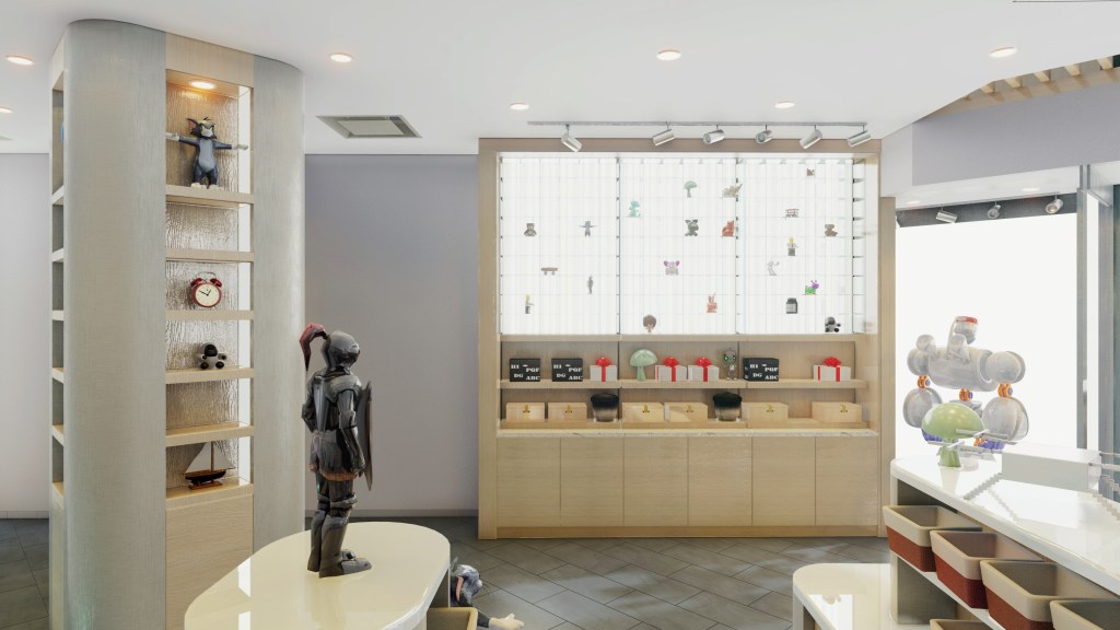
Elevation wise it was divided into 5/8 of usable height for retail area limited with bulkhead.

Everything above it was dedicated to imitating the sky. It was selected as an appropriate natural stratosphere color. It was assigned to the initial option.

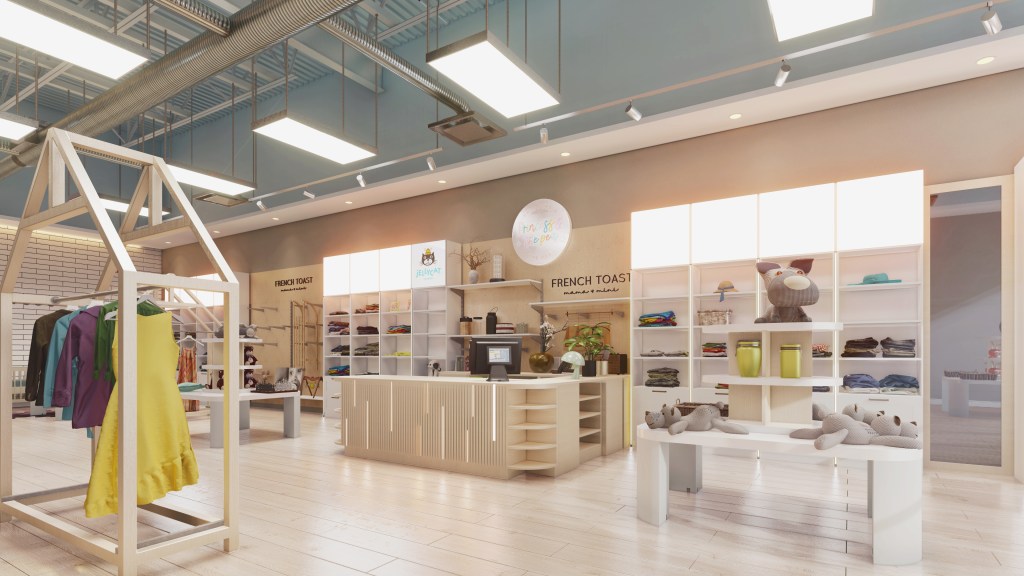
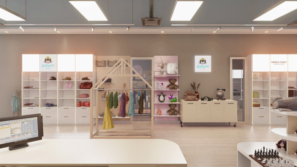
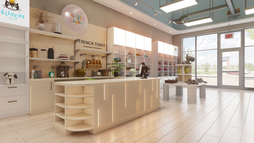
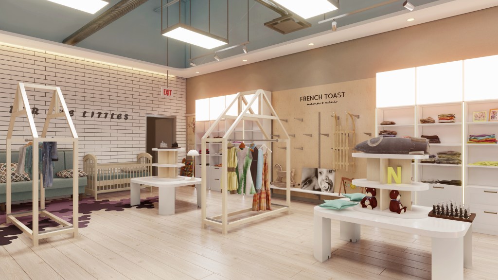
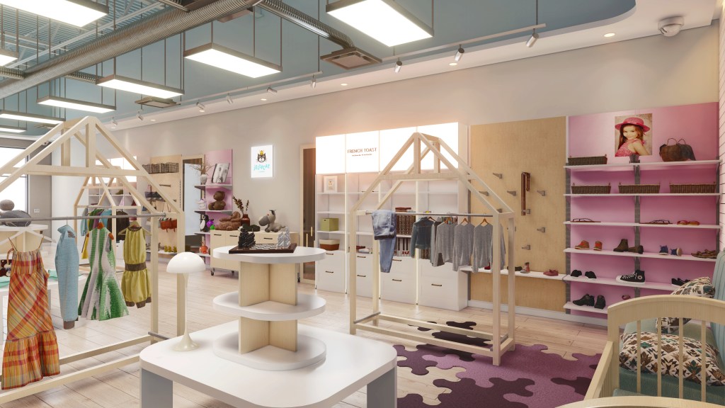
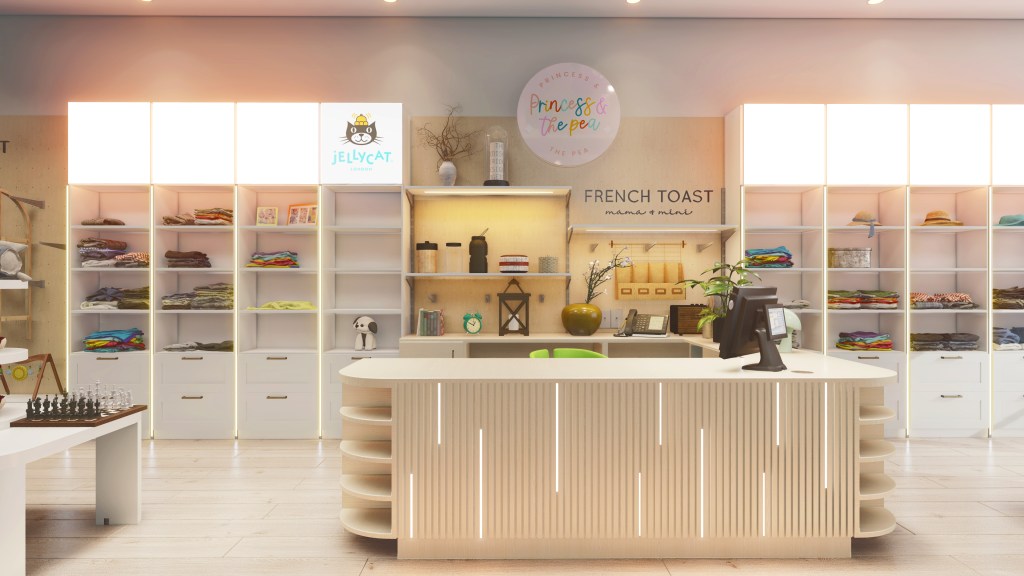
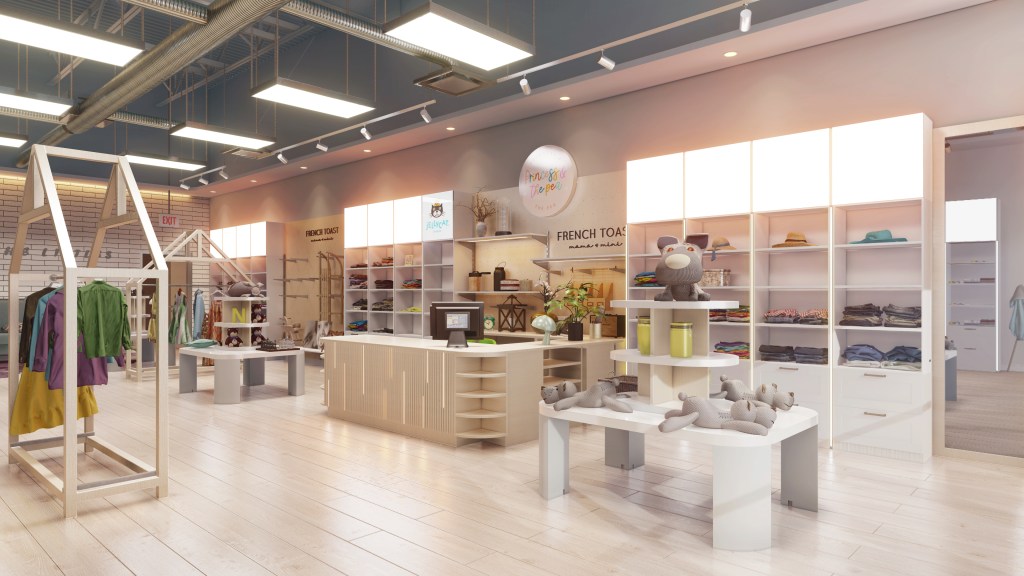
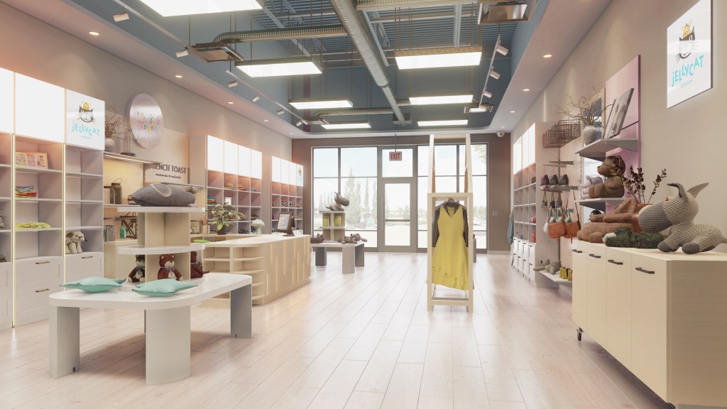
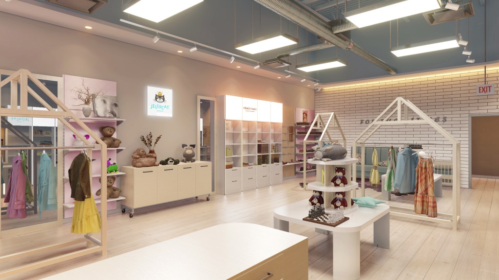
Accent cabinetry made in white oak veneer, all the rest adjustable shelves, stands and modular tall cabinets in painted MDF in satin white color.

The entire finish floor material was selected with a wood grain deck effect luxury vinyl plank.

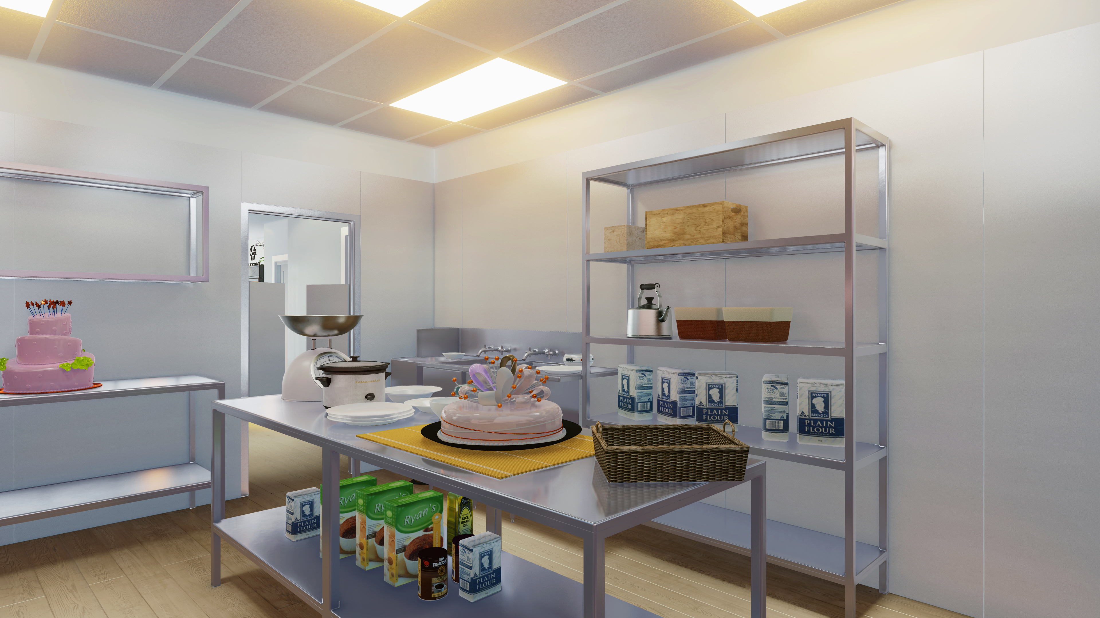
Due limited back of the unit space, the high ceiling allows to hang the steel rack for increased storage.

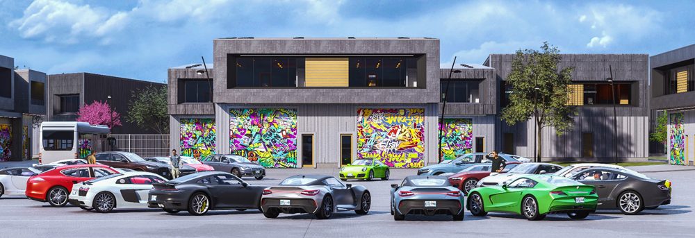
#kidsstore #commercialdesign #commercialinteriordesign #clothingstoredesign #commercialdevelopment #fairytaleinterior #boutiqueideas #brandstoredesign #commercialplazadesign #canadacommercialdesign #edmontonclothingstoredesign #projectdevelopment

FLORAL STORE IN SW OF EDMONTON AB

It was a long time a dream to design the floral store for the LDLine team, due this customer’s inquiry we could combine our passion in landscape softscape design with interior hardscape.

At the very beginning when the site access was available and we entered in to review the unit space, right away raised up the pivotal idea to create the interior with a sense of outdoor space vibe. We were envisioning the historical cities of France or Italy, where flower kiosks or greenhouses embedded into the streetscape between scattered gingerbread masonry houses.

There was no doubt to integrate the touch of greenhouse structure into the interior space. Furthermore, to apply on one tall wall brick veneer feature wall to imitate and enhance the illusion of the store location attached to the historical adjacent building.

The freestanding Walk in Cooler gives an additional showcase effect of the street kiosk for visitors. It makes an intrigue of another room being in the main retail area. Moreover,  beside the primer function of the w.i.cooler to keep the some species of the flower fresh it bears another feature giving the privacy for visitors discussing with florists their inquiries  for services or commodities purchase.

On both sides of the demising walls are arranged the fake windows with illuminated translucent fabric in the frame. It enhances the back alley effect between historical buildings.

Almost one third of the overall space filled by workshop due customer’s requirement to have plenty workable space and storage for tools, new consignments.

The main finish floor material was selected wood grain deck effect luxury vinyl plank which reconstruct the real street decking floor.

To avoid the “Well Effect” of the commercial unit, where the height equals the width from wall to wall it has been decided to add the artificial vegetation wall on the header above the cash counter, door heading to the workshop and the w.i.cooler.

The front entry emphasized with checker style tile to apply the historical aspects of the interior and make the showcase curb appeal with contrast pattern.

Washroom is designed based on barrier free codes requirement with minimalistic elements and integrity of the rest of the workshop

It was developed the optional simplified design for the retail area embrace more light ordinary colors:

Overall though major elements of the design, such as metal, brick, course woodgrain effect, outdoor structure are perfectly rectilinear the designers uses colors and natural forms to soften the rectangularity of the commercial premise.

#floralstore #commercialdesign #commercialinteriordesign #flowerstoredesign #commercialdevelopment #interiorforyourbusiness #boutiqueideas #brandstoredesign #commercialplazadesign #canadacommercialdesign #edmontofloralstoredesign #projectdevelopment

BRITS FISH & CHIPS RESTAURANT

The unique British Fish and Chips restaurant where visitors can find and treated by purely prepared haddocks portions and typical northeastern English traditional chips made from the fresh potatoes on-
site rather than the frozen varieties favored by fast-food outlets.

This chain has two restaurants in downtown of Edmonton and on a Southside. The Newly designed
restaurant –fish store is located on North part of the City.

Our team aimed to create the sense of the matured restaurant with oldest and most well known U.K.
restaurants vibes with rich and fascinating history of the North East of England seafood eateries along
the fisher’s bays and ports.

The area is segregated onto three main zones.
The fish store with imported commodities showcase and shelves, bar zone where visitors are served
with alcohol beverages, and the dining area with chill out interior design.

Simultaneously, this business is intended about of 40% is for takeout food.

The pivotal concept of this restaurant interior was to revive the submarine hull inspired by the classic
science fiction adventure novel “Twenty Thousand leagues under the seas.

The detailed elements allows any visitors reminiscent us about the Captain Nemo adventures or prompt it for those who unfamiliar with that novel.

Such finish materials as corrugated metal panels, port holes windows, deck planks on the floor, mural
wall with sea creatures drawn by chalk, steel frames , headers elements make the sense of the
submarine body structure and multiple fits of pipes all those patterns make the integrity and solid shape of the sea vessel effect.

#restaurant #commercialdesign #commercialinteriordesign #restaurantdesign #commercialdevelopment #submarineinterior #fishrestaurantideas #restaurantinteriordesign #commercialplazadesign #canadacommercialdesign #edmontonrestaurantdesign #projectdevelopment

BUNGALOW ADDITION CONSTRUCTION IN WILLOW PARK CALGARY AB

Beside the amendments in the foundation extension and increasing the number of the bedrooms on the main floor the main intention of this project was to enlarge the great room area combined with the kitchen and dining room.

The existing structure had a standard sloped roof with an eight feet height ceiling. However, it has been made a decision to increase a roof type from the hip one to hybrid one mixed version of open gable to skillion and lean-to which ensure to make the semi vaulted ceiling.

Once the high ceiling has been constructed the “well effect” has been balanced with faux beams. Multiple void relationship promotes the interconnection among the main floor high ceiling with transom windows and open to below staircase which enhance the natural lighting penetration to the basement.

Those voids and other double height spaces provide the house with visual and spatial interest, but they are mainly designed as part of the building’s energy and lighting efficiency strategy.

CAKE TIME BAKERY IN SHERWOOD PARK

After years of work cooperating with another vendor one of the most talented bakery owners has decided to open the independent business in the heart of Sherwood Park.

It was a pleasure to get the inquiry and to be involved in the interior designing of the owner’s dream bakery store. 

The pivotal idea of the business is to design and make the custom cakes, therefore, the interior isn’t suggested to have ample tables and seats, mostly for making the orders and pickups of the product by customers, when it is ready. 

The interior was inspired by French style bakeries with pastel colors and mosaic floor appearance. The first impression of the patterns is supposed to remificent you about the luxury cakes and deliciousness. 

The seating area is designed with open to above concept and all the rest of the entry area is outlined by tiered bulkhead with recessed pot lights.

The middle section of the unit has a room for the workshop lessons. At the very back of the store is located the bakery kitchen, fully organized properly with all the necessary equipment for handy and efficient workflow routines.   

“KUJI TOYS” YOUTH STORE IN WEST EDMONTON MALL

KUJI TOYS

One of the unique stash stores, which sell figures made of high quality materials and stand out for their special size and detail.

 This business is located in West Edmonton Mall Shopping Centre. Youths were anticipating this store to be opened for a while. Finally, LDLine crew has been dedicated to design the vibe of new generation stash-exhibition which reflects the envisioning of the elegant sculptural art, collectable toys and blind box toys for enthusiasts.

The pivotal goal of interior design pitch unveils the contrast of the materials such as stainless steel versus light oak veneer which balances the warm tones and the cold elements.

Showcases are made with white oak pattern melamine with backlit back panels.

Our team encountered a challenge to incorporate the base building bearing concrete column located almost in the center of the leased unit.

However, the cabinetry and Cash counter floor plan development allowed us to built onto the narrow shelving display complying the minimum ingress  egress requirement having sufficient room for full visitors occupancy

To keep the simplicity of the irregular shape of the unit it has been decided to apply the painted white gypsum board ceiling.

The next to the window display area has the ceiling slatted wood panels due the Landlord’s control zone requirement in order to have the access to the concealed above the ceiling mechanical units. Another word, this deficiency has compelled us to come up with ceiling diversification and dilute the plain drywall ceiling emphasizing with wood patterned slatted panels.

The Optional Design unveils cold colors mostly. It embraces more top display screens on shelving manga books characters.

Contemporary Farm Style House

This Modern Residential house is situated in Okotoks Alberta CA 2023

Total house area is 3546 ft2 (useful main floor and basement)  1340 ft2 (Barn).

9 ft ceiling height on each floor with 12 ft height ceiling in the great room.

The residence was conceived as lifetime house for couple, formed essentially by the main house with private space on the main floor and the guest and entertainment room in the basement.

The property also has the multifunctional barn with two bays for virtual golf gaming equipment. It is deemed to be as men’s cave feature.

Initially, the owner’s intention was to design the walkout basement with above deck and concrete patio and no barn location on the property. However, this ideas has been changes on more organically embedded option with wide spread structure appearance.

The gravel driveway links the different parts of the residence, the long way entry with native grown trees and shrubs vegetations seated on the uneven land and the far flat portion which starts from the natural drainage swale. From that relief frontier is planned to be a house and barn location. 

The long low succession of volumes is inserted into the farmland acreage environment, with generous glazing emphasizing the connection to the southern Alberta nature.

The idea to keep the main floor house gently lifted off the ground with their broad glazing and diversified with multi elevation structure shapes takes full advantage of the natural setting while disturbing the environment as little as possible.

Our crew has faced the most challenging stage in the designing process to incorporate the roof in a multi elevation structure and attached garage avoiding the errors and vulnerable spots for snow stuck.

The main roof is covered by asphalt shingles and emphasized with corrugated.

Overall, the single home is balances with 3 bedroom 3 bathroom and with versatile such rooms like theatre, wine room, secret office room, pool and fireplace rooms.

Franchise Bubble Tea Caffe “Quickly”

Youth Choice Bubble Tea Caffe!

Our team has been hired to redesign the existing bubble tea cafeteria brand where youth loves to hang out and taste the broad variety of drinks and meals.

Overall the dining space occupancy embraces 32 seats.

The Interior Design is prompted and inspired by K-POP Korean Culture utilizing the neon colorful lights. The array of horizontal, vertical and diagonal lines creates the dynamic effect to attract the active groups of urban constituencies.

Mirror plank strips make the intrigue of extra visual untouchable space and reflect the cityscape. The bar area ceiling decks out with stretched ceiling circles as a hint of bubbles in the air.

Notwithstanding the foregoing selected finish materials characterize the modern style interior allowing the franchise to be immersed into the urban space organically.

Leave a comment

THE NEW GENERATION SUSHI RESTAURANT

Feng Donburi Restaurant

It deemed Sushi Japanese food restaurant mostly orientated for takeout and delivery services. However the interior has the vipe of East Asia for dining inside

Overall the dining space occupancy embraces 22 seats.

The pivotal idea has been transferred from the traditional Japanese Building technic in Architecture with dominance of timber paneling.

Maybe To someone with limited knowledge of building design and construction, the country’s hand-built tearooms or sushi bars may appear beautiful yet obsolete in their conveyance of seemingly antiquated practices.

In this case we ain’t mimicking the style or features of historic building, but challenge the relative experience and interior quality if contemporary material practices and experimenting with planes.

In order to plunge into the cultural aspects the interior has a mural wall reminiscent the structure of the traditional Japanese architecture.

On one hand is shown many of warm color timber paneling deploying non-ordinary dynamic arrangements, on another hand in order to delute the perfect shapes the interior has the rough city factory white painted brick wall to emphasis the urbanize.

Floor is covered by 8” x 48” porcelain tile planks that are perfect for winter time when the entry usually is wet area, therefore meet the public spaces safety standard.

The selected finish materials and colors bring customers into the warm season of Japan. Furthermore this design is timeless and cozy, which is deemed to be efficient for the franchise avoiding inevitable redesigning over the decades, pursue the trends down the road.

Modern Single House in Hodgson

874 Hollands Landing NW

This Modern Residential house is situated at Hodgson subdivision SW of Edmonton.

The lot is wrapped by a curved road and the corner dwelling has the advantage to disclose the shape volume broadly. Moreover shown house structure is designed with mixed matching exterior finish materials such as “Kayu” wood planks, vented aluminum panels and stucco.

It is a two storey house with a developed basement and three vehicles garage, four bedrooms five bathrooms, a full kitchen with open to above ceiling. The total area is 4226 sq.ft. above the grade. With nine feet ceiling In a main floor and basement and standard eight feet height on the upper floor. 

Single Family Home in Ebbers Community

The house is located in North East part of Edmonton Alberta and 10 kilometers of downtown city.

The architecture is classified as Neo-traditional style, which is so common in Ebbers community. As main exterior finish material has been selected the traditional/clapboard profile siding with bold and simple wide trims, corner battens, window bands, shadow boards, porch columns and fascia’s painted in white color in order to contrast with dark color siding. For diluting the repetition it has been decided to emphasize the three façade sides with natural cedar shake tiles and urban black color brick veneer.

The interior is developed in minimalist style with sense of ample of light and air. At the very beginning when you enter inside opens the view to the perspective of the interior and natural light penetration from the “open to above” ceiling creates the atmosphere of contemporary dwelling where each focal point intriguing.

The upper floor corridor opens to below view to the entry and a great room. Beside the standard master bedroom and ensuite/walk in closet allocation it would be reasonable to highlight the feature of the upper floor such as shared walk in closet and bathroom for same gender kids rooms. Each kid has the doors to the same section.

The house is situated on sloped infill that allows to design the walkout basement.